방법 - 이미지 뒤집기
CSS로 이미지를 뒤집는 방법(거울 효과 추가)을 알아보세요.
이미지 위로 마우스를 이동합니다.
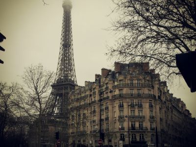
이미지를 뒤집는 방법
예시
<style>
img:hover {
-webkit-transform: scaleX(-1);
transform: scaleX(-1);
}
</style>
<img src="paris.jpg"
alt="Paris">
참고: 이 예는 태블릿이나 휴대전화에서 작동하지 않습니다.
팁: 3D 변환 에 대해 자세히 알아보려면 CSS 3D 변환 자습서로 이동하십시오 .
텍스트가 있는 3D 뒤집기 이미지
텍스트가 있는 이미지의 애니메이션 3D 뒤집기를 수행하는 방법을 배우십시오.
파리
정말 놀라운 도시
1단계) HTML 추가:
예시
<div class="flip-box">
<div class="flip-box-inner">
<div class="flip-box-front">
<img src="img_paris.jpg"
alt="Paris" style="width:300px;height:200px">
</div>
<div
class="flip-box-back">
<h2>Paris</h2>
<p>What an amazing city</p>
</div>
</div>
</div>
2단계) CSS 추가:
예시
/* The flip box container - set the width and height to whatever you want. We
have added the border property to demonstrate that the flip itself goes out of
the box on hover (remove perspective if you don't want the 3D effect */
.flip-box {
background-color: transparent;
width: 300px;
height: 200px;
border: 1px solid #f1f1f1;
perspective:
1000px; /* Remove this if you don't want the 3D effect */
}
/* This
container is needed to position the front and back side */
.flip-box-inner {
position: relative;
width: 100%;
height: 100%;
text-align: center;
transition: transform
0.8s;
transform-style: preserve-3d;
}
/* Do an horizontal
flip when you move the mouse over the flip box container */
.flip-box:hover .flip-box-inner {
transform: rotateY(180deg);
}
/* Position the front and back side */
.flip-box-front, .flip-box-back {
position: absolute;
width: 100%;
height: 100%;
-webkit-backface-visibility: hidden; /* Safari */
backface-visibility: hidden;
}
/* Style the front side (fallback if
image is missing) */
.flip-box-front {
background-color: #bbb;
color: black;
}
/* Style the back side */
.flip-box-back {
background-color: dodgerblue;
color: white;
transform: rotateY(180deg);
}